Ahhh, our precious logo. She’s been used in many decks, docs, social posts, and LOTS more. But where did she come from, and what went into her creation? We’re cracking open the SocialQ archives for this one ????
Our content team breaks down the creative process:
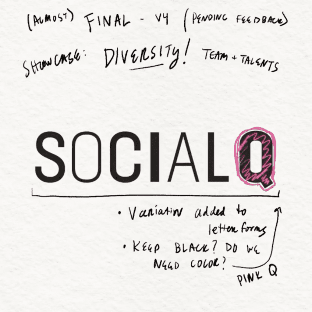
〰 Start illustrated: Like anything we approach strategically, a brain dump was key. We took to paper & pen and sketched what came to mind. We knew we wanted to display “diversity” but weren’t sure how yet, so our first iteration started as sketching out simple block betters!
〰 Narrow it Down: We thought long & hard about where and how our logo would be used. Will any of the doodles easily be able to adapted to a variety of platforms? With this in mind, we choose one that resonated with us.
〰 Vectorize: We took a photo of our doodle & created a vector (AKA digitalized lines) in Illustrator to “re-create” the drawing digitally. It was bare bones, but it helped us approach our next step…
〰 Apply Typeface: We searched around for some typeface that came nearest to our vectors. We battled with Ariel, Helvetica, all the basics. As we dug around, we eventually landed on Hind!
〰 Assess Weight: From our goal of displaying “diversity” we got the idea to mess around with font weight — regular, light, bold. After a bit of shuffling, we landed on our current logo’s iteration.
〰 Add Color: Lastly, we took our brand colors and tried out a few versions. All pink, blue/pink/yellow, but ultimately decided the “Q” would get the color treatment, representing the bright, approachable feeling of diversity coming together. ????
While this was ~our~ path to a logo, we know the creative process is different for everyone, and your end result may end up looking completely different than you ever imagined. But that’s the beauty of creative. Trust the process and let the ideas flow. ????